It’s not just the stories between the covers that I love – it’s how a book is presented and designed. If you’ve been following this blog for a while, you might know that I’m really interested in cover design. I really love taking the time to admire what effort has gone into making the outside (and inside) of a book look awesome – whether that’s the colour, the artwork, the fonts or something like a slip-cover.
I thought it would be a nice idea to make some kind of feature on this blog, where I talk about all of this! So, in the hopes I do make more posts like this – here’s my first one, all about typography!

I adore pretty fonts – there’s just something really aesthetically pleasing about brush fonts and handwritten ones especially. I’ll admit sometimes I do judge a book by its cover – if it’s got a really cute font on it, the likelihood is I’ll pick it up and have a look! Here’s a few titles I love.
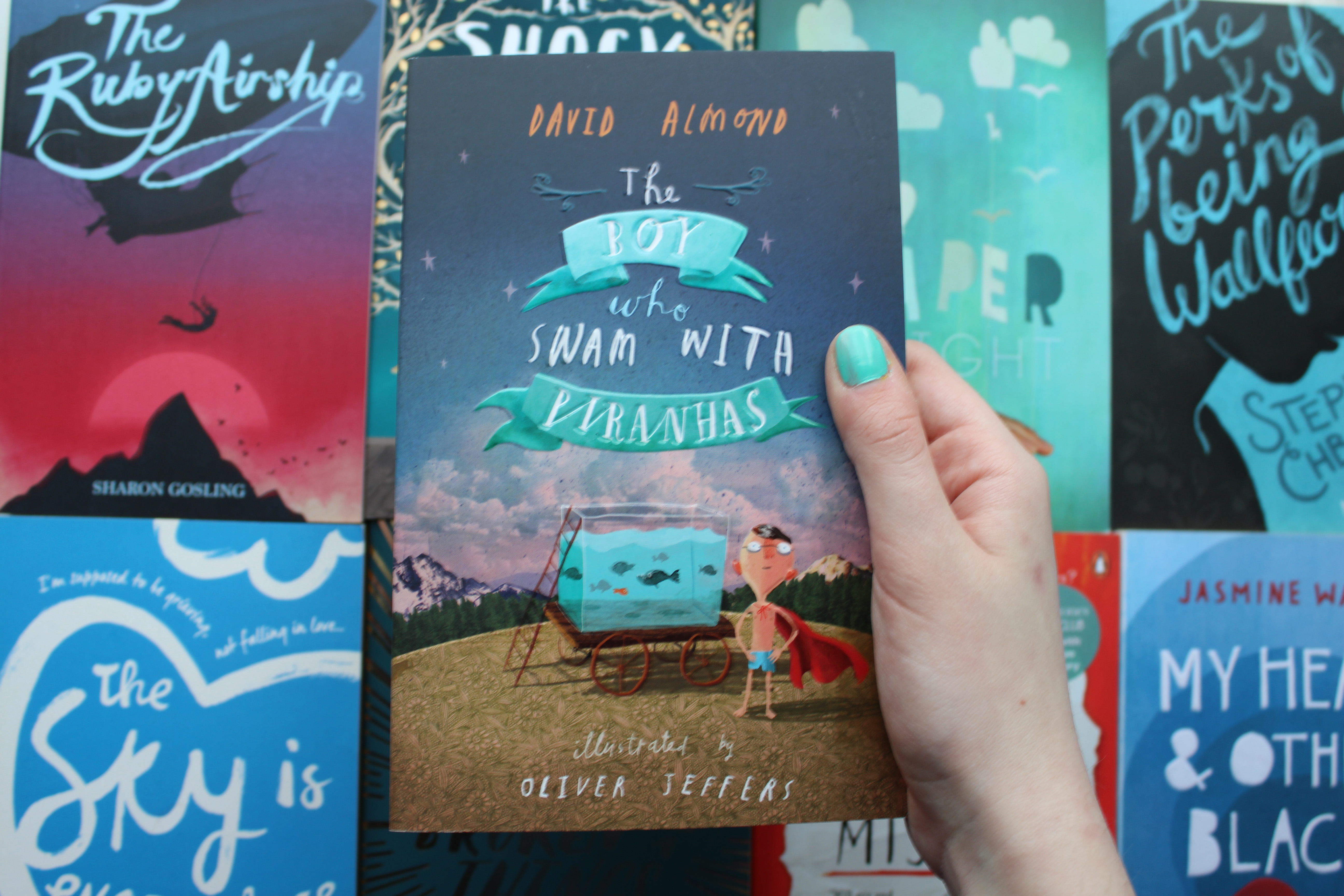
First up – The boy Who Swam with Piranhas. This book is illustrated and designed by Oliver Jeffers, who is one of my favourite illustrators. The title is in his handwriting and I just love it so much. I don’t really know how to describe it properly – I just adore the uneven capitals and childlike joined-up letters. It’s really pretty!
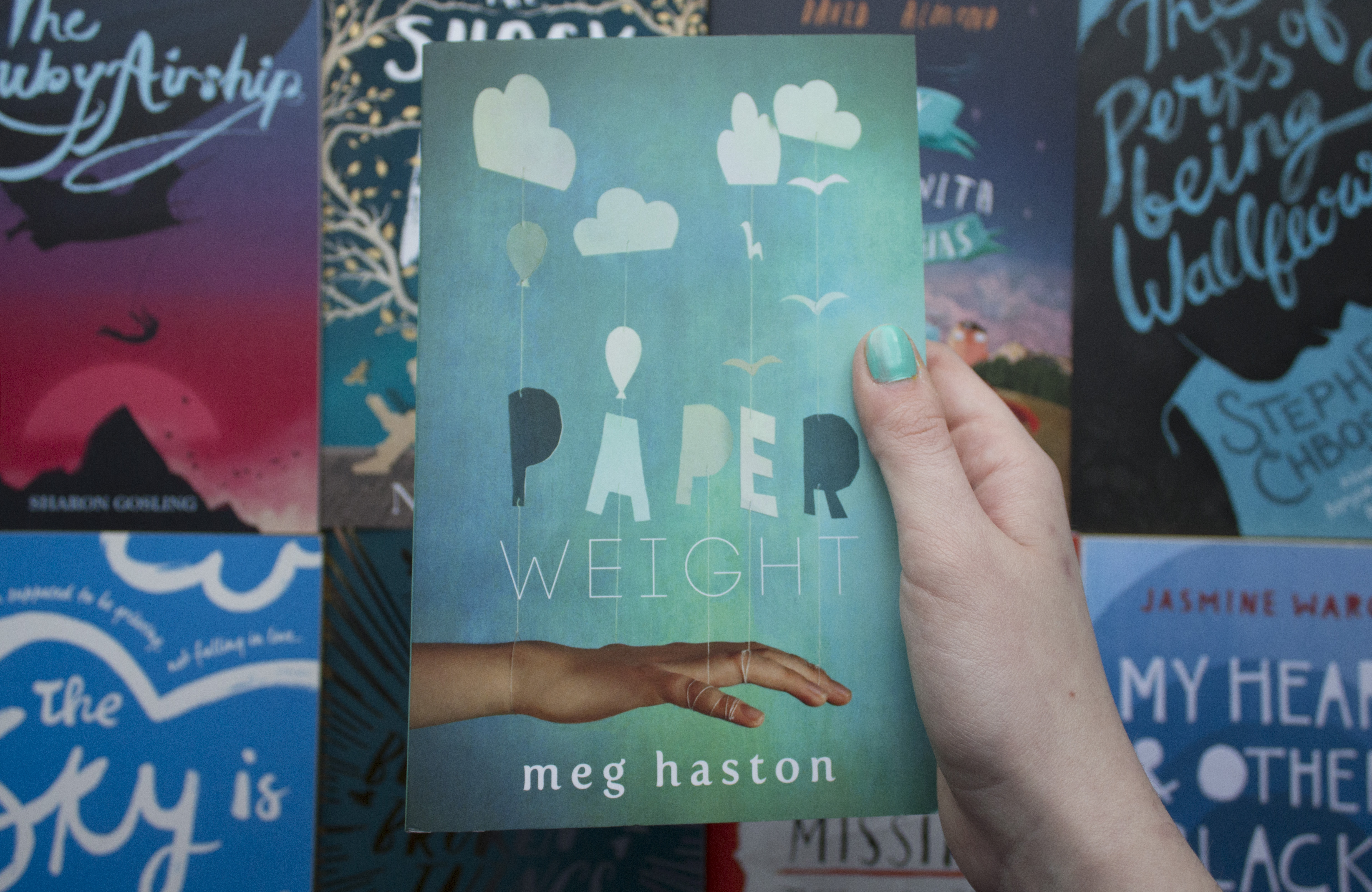
Here’s Paperweight by Meg Haston. The cover is quite similar to the US edition, though this UK (Hot Key) version uses a different style for its title. I really like the ‘paper’ part, as it’s so bold and three-dimensional, and connected to other elements of the cover. The ‘weight’ font complements it really well, despite how different it is.
The Shock of the Fall by Nathan Filer is a book I picked up just because of the cover. I’d seen it around online as it won the Costa prize, but hadn’t actually looked into what it’s about (I only read the blurb after admiring the cover for aaaaages in a store). I really love the brush font, and it reminded me a bit of Oliver Jeffers’ whimsical style. It’s really eye-catching!
If you enjoyed this post, please leave a comment or share it around and let me know! I would love to do some more posts like this in the future, talking about cover design and artwork.
Also, if you’re aware of the artist behind these covers, please do let me know so I can add them in! I did try to research, but found it pretty hard to find them.

I love posts that focus on cover design; I think it’s an important part of the book itself, and that a good cover can go a long way. Can’t wait to see more of these posts in the future! 😀
Thank you so much! 🙂
You’re welcome! 😉